Welcome to the SPAC Brand Hub
This hub is your resource for understanding the refreshed SPAC brand—designed to help you maintain clarity, consistency, and creativity across all communications. Whether you’re a partner, vendor, or team member, you’ll find the tools and guidelines you need to represent SPAC with confidence. From logos and color palettes to messaging and mockups, everything here reflects the energy, legacy, and leadership of the SPAC community.
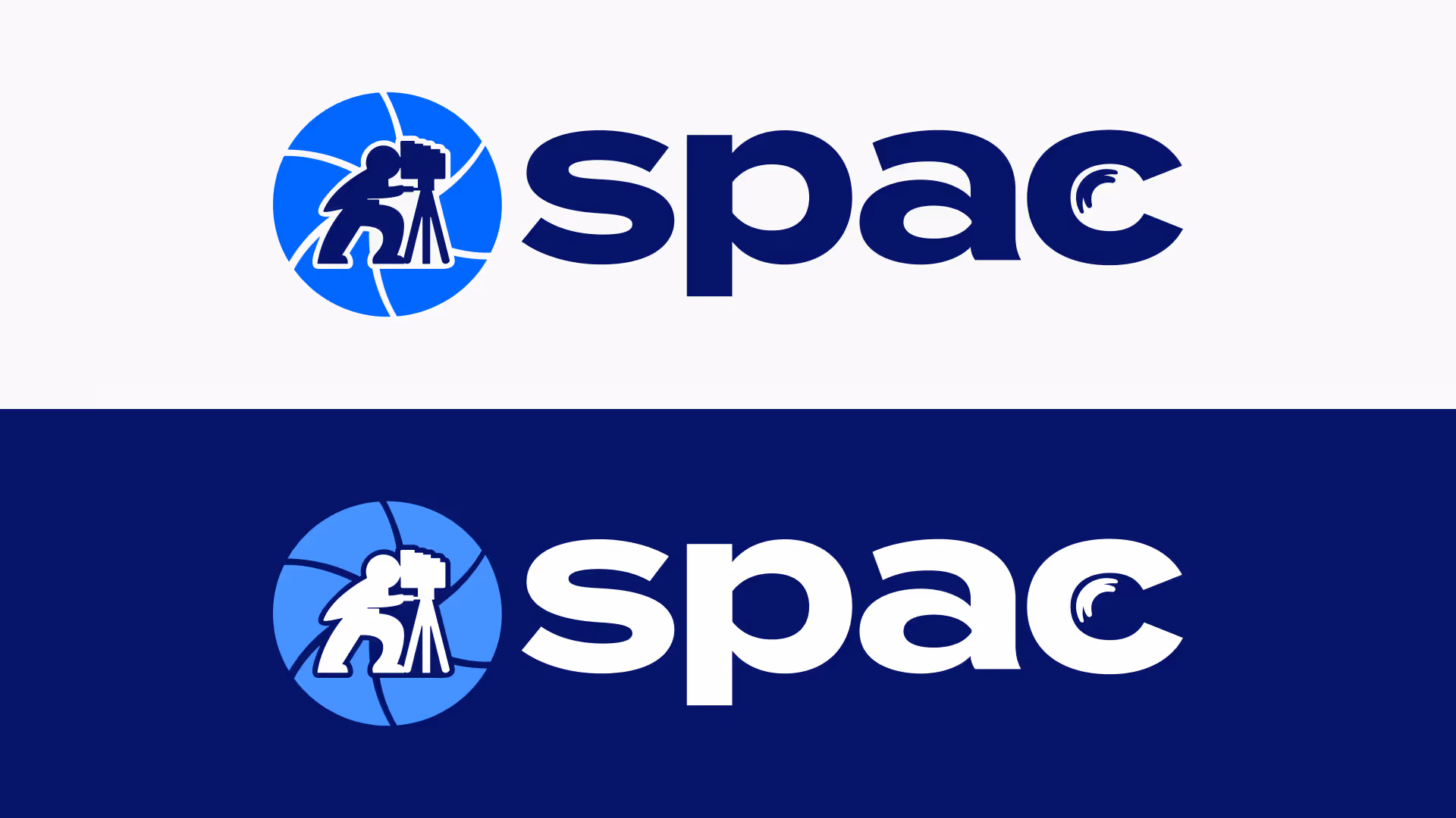
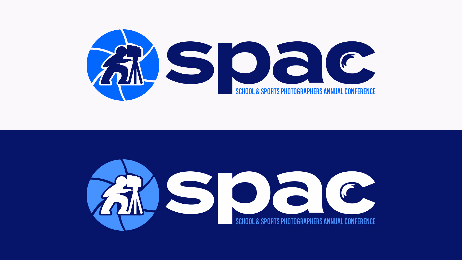
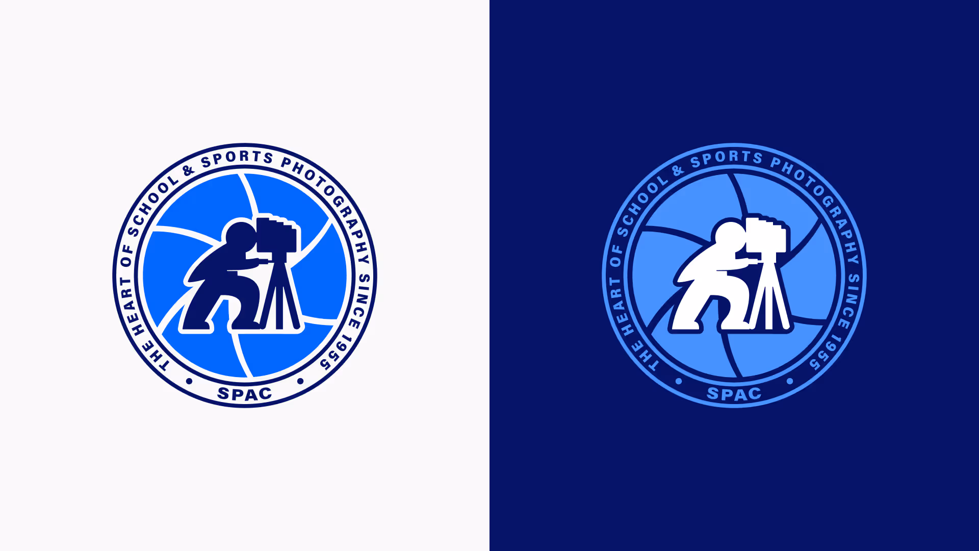
Logos
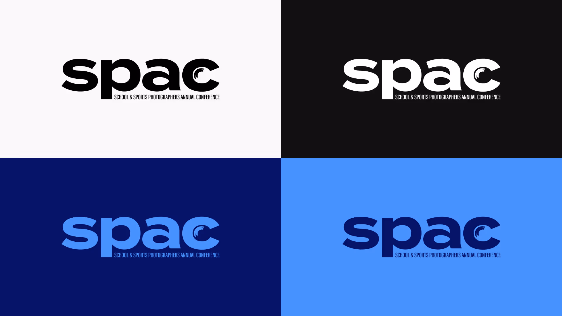
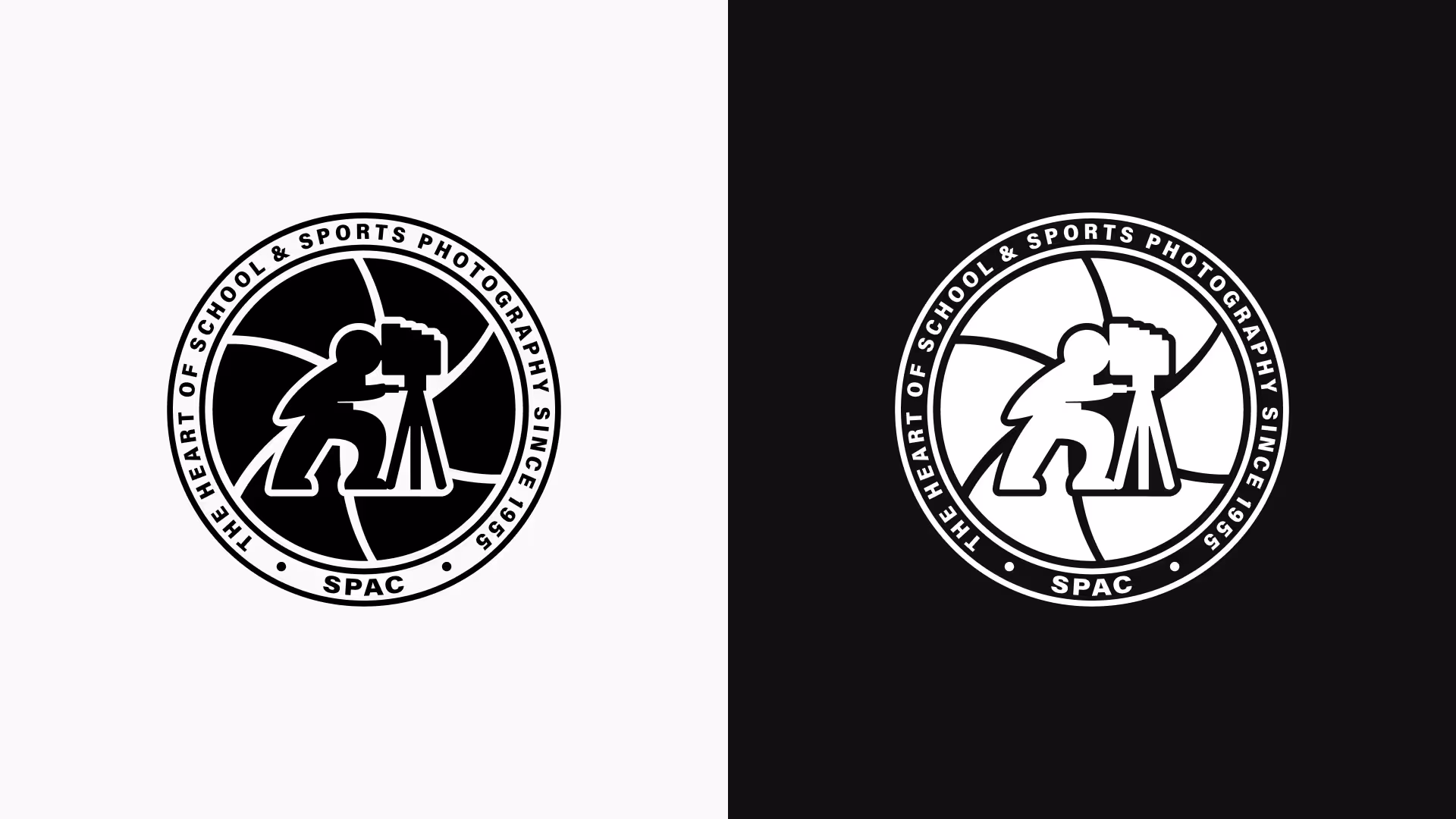
The SPAC logo is the cornerstone of our visual identity. It reflects our legacy, energy, and connection to the volume photography community. Below you’ll find approved logo variations, usage guidelines, and downloadable assets to ensure the brand is always represented clearly and consistently.
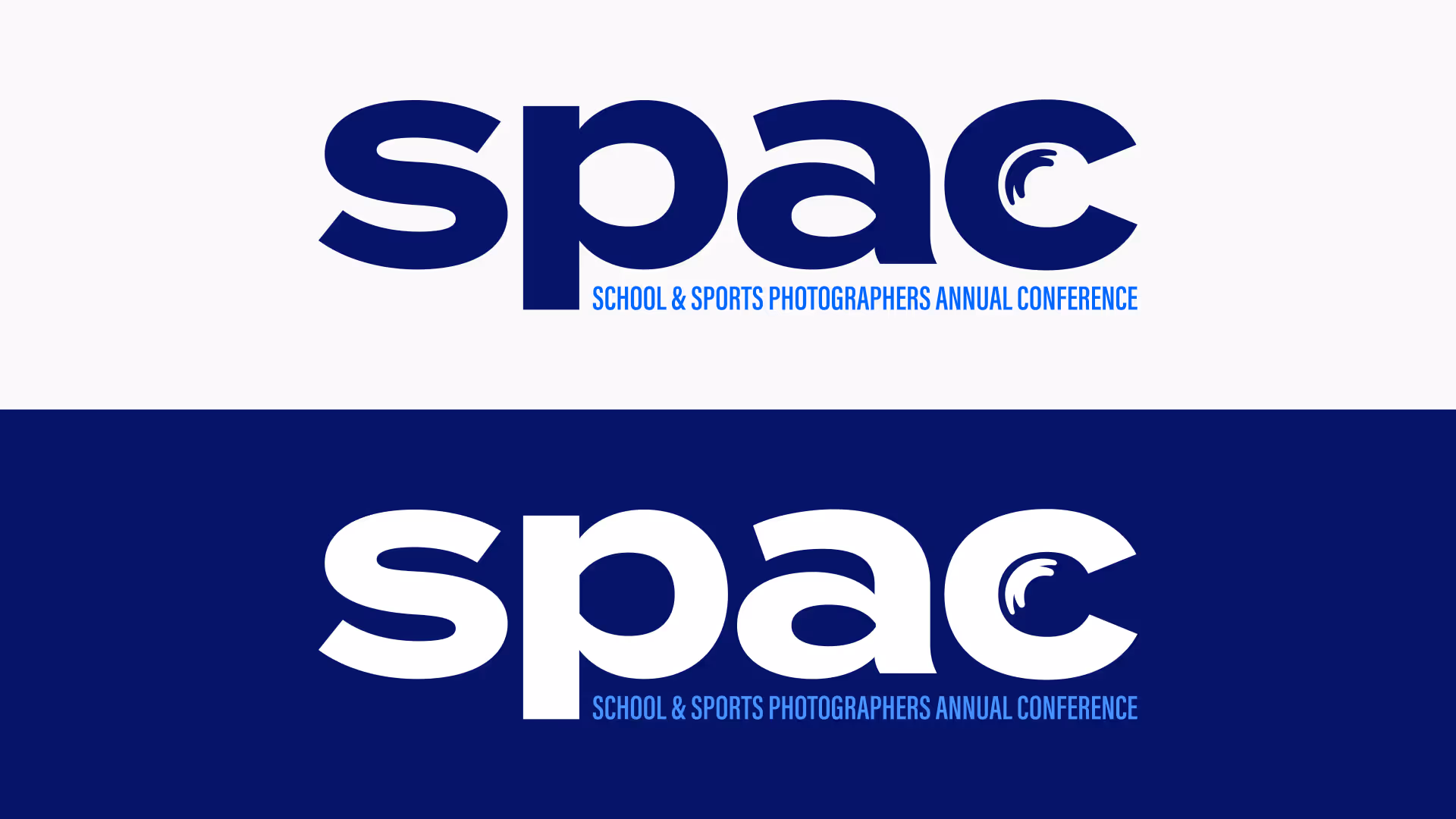
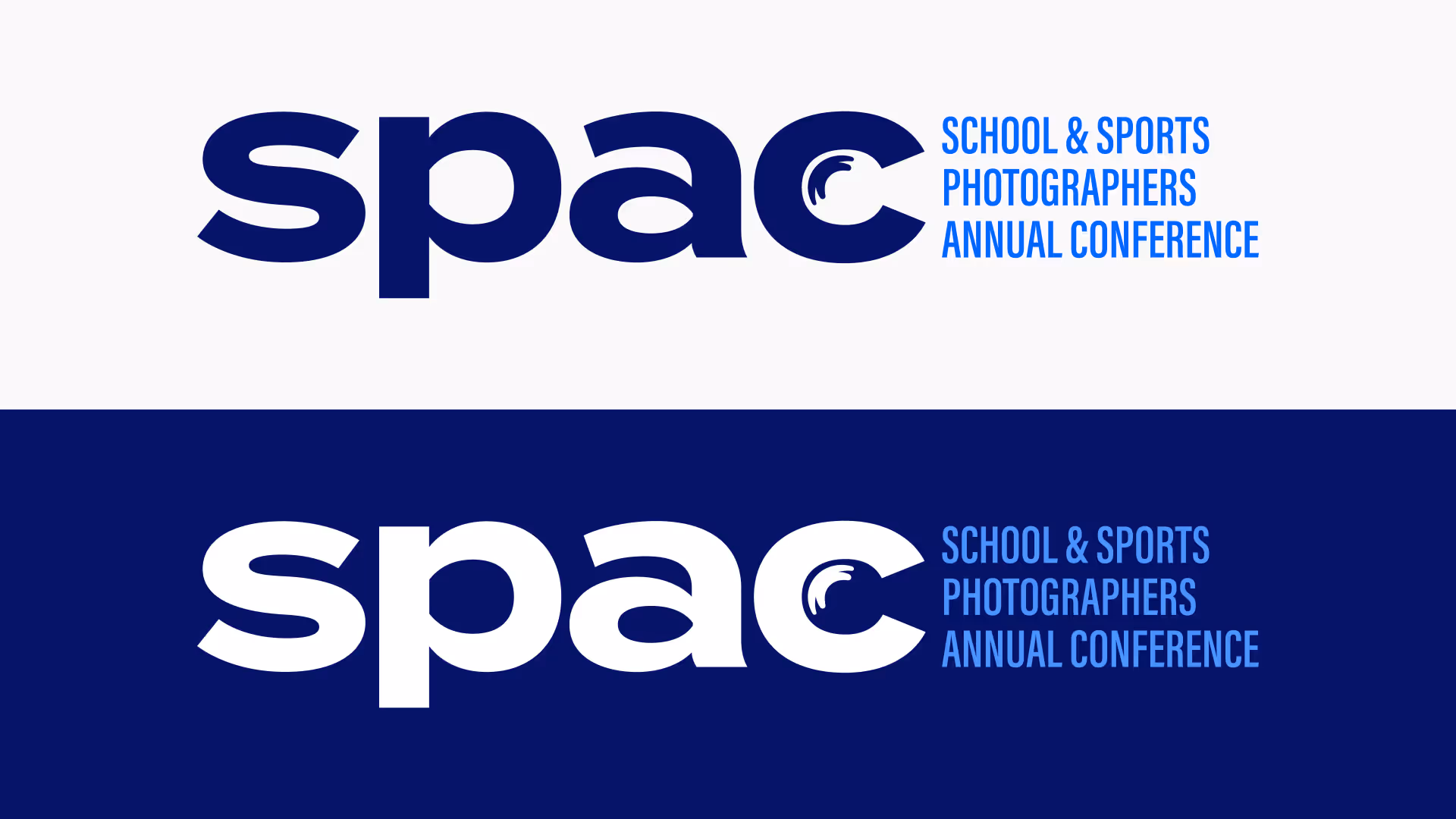
Two-tone Logos
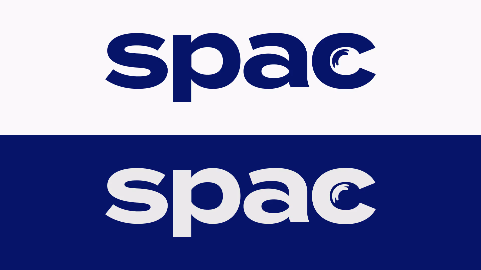
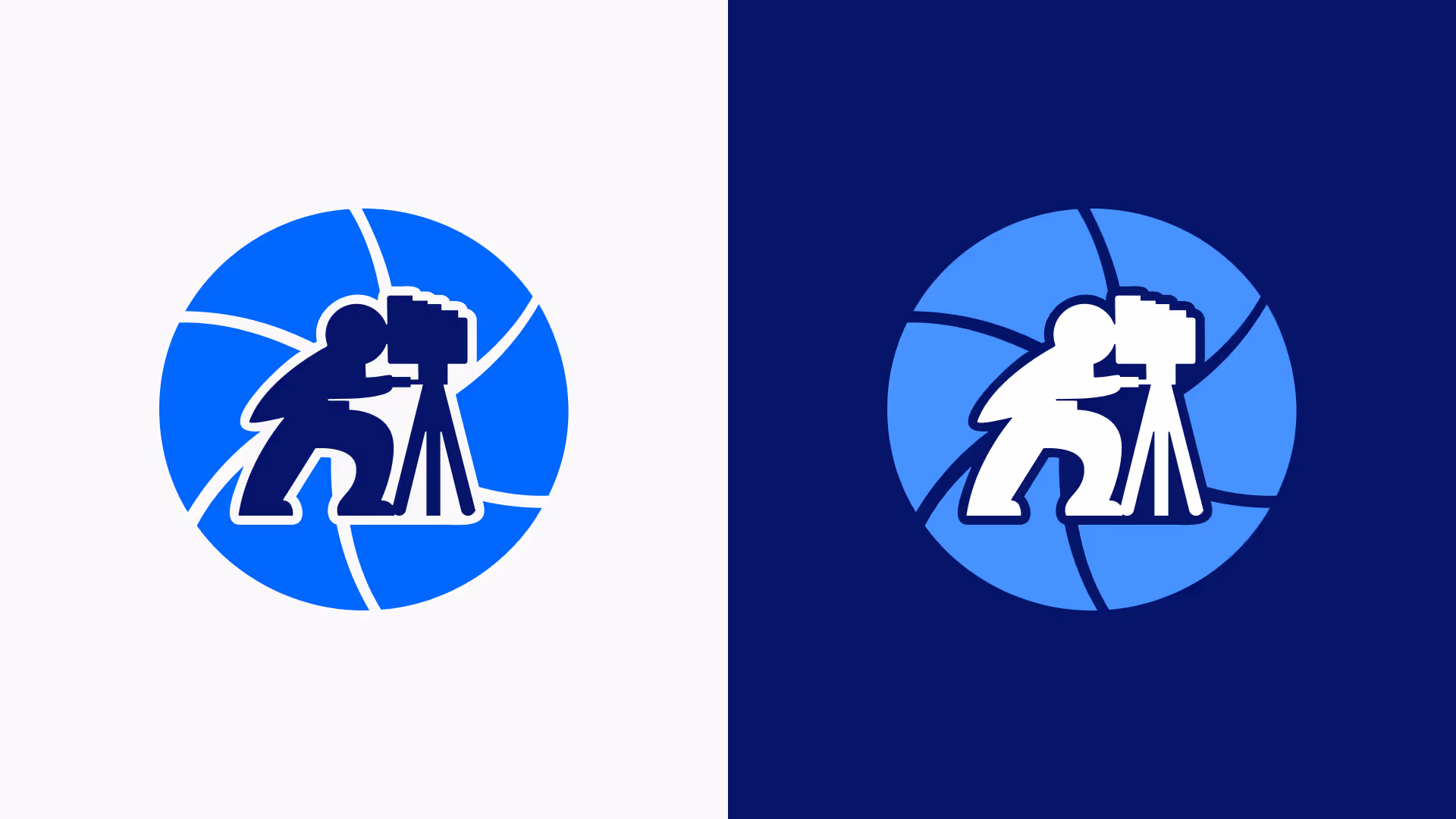
Monochrome Logos

Colors
SPAC’s color palette combines our signature blue with a bold, energetic range of supporting colors inspired by school spirit and sports team culture. These colors bring vibrancy and momentum to the brand while maintaining clarity and professionalism across all touchpoints.

Primary Colors
Typography
SPAC’s typography is clean, modern, and built for clarity. Our typefaces are selected to balance professionalism with approachability—supporting everything from bold headlines to accessible body copy. Consistent typography ensures our brand voice looks as strong as it sounds.
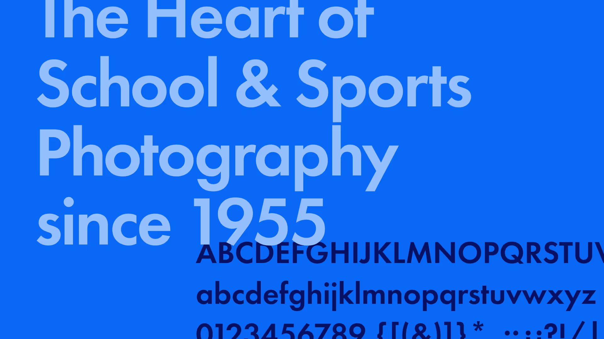
Futura PT
Futura is used for SPAC’s headlines to create a bold, modern, and confident first impression. Its clean geometry, sharp angles, and timeless style make it an ideal choice for grabbing attention while maintaining professionalism. As a sans-serif classic, Futura brings structure and energy to the brand—perfectly aligning with the forward-focused spirit of SPAC.
Futura PT is available to use through Adobe Fonts, making it easy to sync across devices and design tools for anyone with an active Adobe Creative Cloud subscription. This ensures consistent use of SPAC’s headline typography across digital and print materials—no separate licensing or manual installation required.
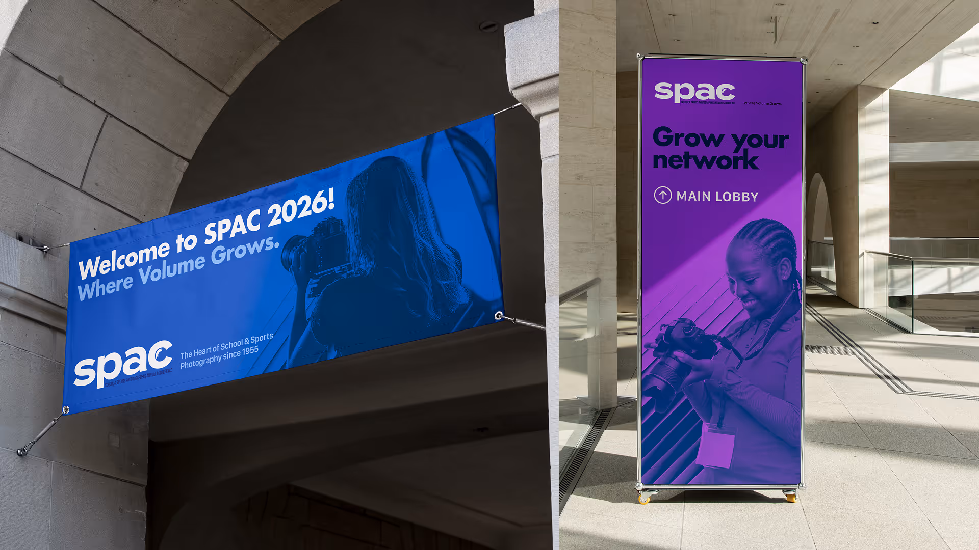
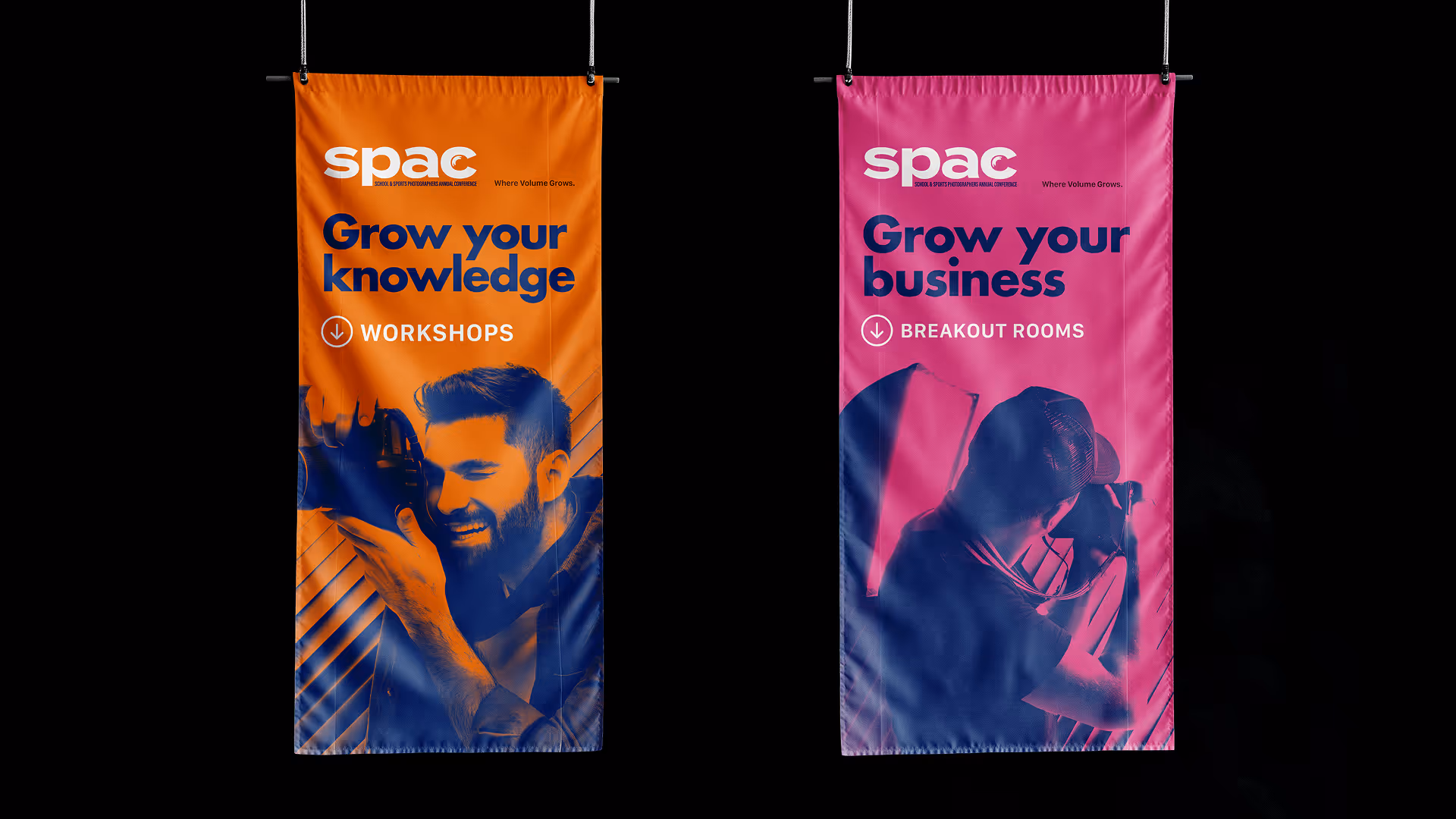
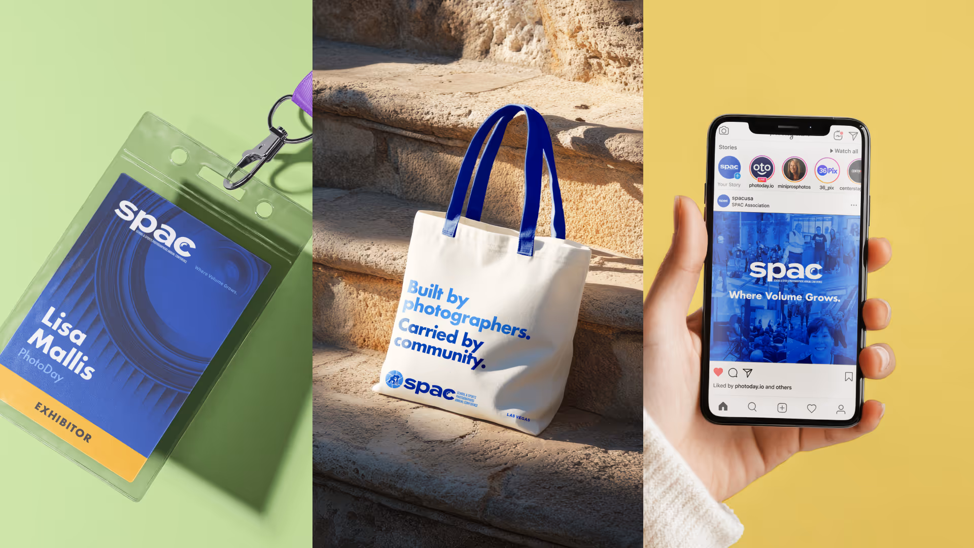
Mockups
To help visualize how the SPAC rebrand comes to life, we’ve created a series of mockups showcasing the identity across real-world applications—from signage and name tags to swag, social posts, and more. These examples demonstrate how the new brand system creates a cohesive, vibrant experience at every touchpoint—online and in person.